Information architecture
Redesigning Blibli account merging info page and error flow
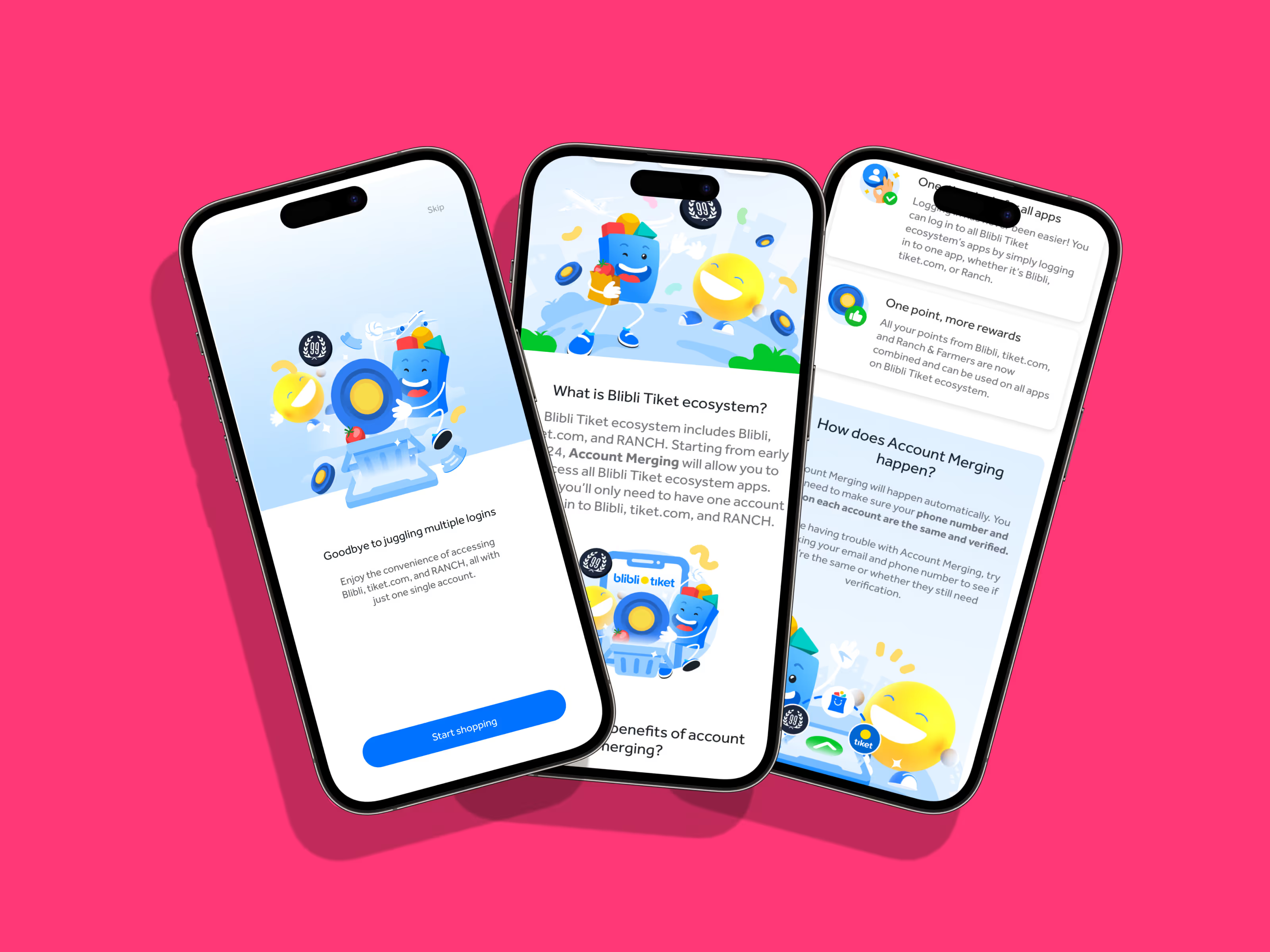
Blibli planned to introduce the Blibli Tiket ecosystem, encompassing three companies: Blibli, tiket.com, and RANCH. Through this initiative, Blibli aimed to offer the convenience of single sign-on to enhance user accessibility across platforms.
Timeline
November – December 2023
My role
UX writer
Info page context
We aimed to highlight the importance of aligning user credentials for unified account login within the Blibli Tiket ecosystem.
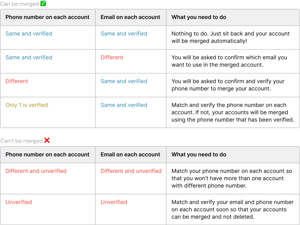
Based on user data, we found that users often had different email or phone number configurations across Blibli Tiket platforms. To ensure seamless access to all services, including single sign-on, users are encouraged to match their credentials across all platforms.
Problem
Unscannable tables and redundant headers
When reviewing the design, we discovered that users found it difficult to scan tables quickly, needing to read through each row. Moreover, redundancy existed between the subheadings and table headers.
Approach
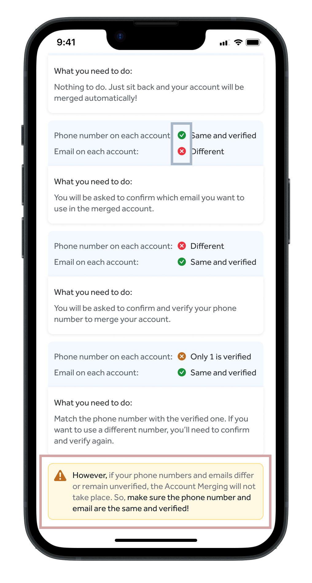
Colour-coded table with headers highlighting key details for users to verify
To improve user experience, I implemented a colour-coded system. This visual aid streamlines the scanning process, making it more intuitive and user-friendly. I adjusted the table headers to focus on phone numbers and emails, key details that users need to verify.
Solution
Icons for easy scanning
The colour-coded system was translated into icons for easy scanning. This approach ensures usability on both desktop and mobile, with slight adjustments made for mobile compatibility.
Info box for a concise summary
The original table detailing non-mergeable account cases was replaced with an info box for a concise summary. Key points are emphasised in bold, directing users to review their cases if not previously detailed. There's a strong focus on ensuring users have identical and verified credentials across the Blibli Tiket ecosystem.
Error context
When we introduced the convenience of single sign-on, an error caused infinite loading, leaving users waiting without clear guidance on what to do next.
Problem
The skip button serves two purposes, making it unclear when it skips onboarding versus an error.
When tested with 5 users, none perceived the skip button as a way to escape the infinite load, they all force-closed the app instead. This shows that retaining the second function is ineffective, as users don't use it. The error message is unclear about the cause of the problem. It offers two buttons: cancel and log out. If the user selects cancel, they are redirected back to the infinite load issue. Conversely, logging out contradicts the user's goal of a seamless single sign-on experience.
Proposal
Clear navigation function
The idea was to replace the skip button with a back icon for users who want to go back and not proceed with single sign-on. If loading continues for 10 seconds, a retry button appears to help users escape the infinite load. This change removes the skip button's dual function.
Revise the error message
The error message now provides users with a clear choice. Instead of focusing on the consequences, it asks whether the user would like to retry the login process or proceed without logging in. This approach offers a straightforward option, eliminating the loading loop.
Final design
Automatically displays a clear error message after a 10-second load
When the proposal was tested, participants preferred an automatic resolution, as they believed the error was system-related, not their fault. The final solution triggers a bottom sheet if the screen continues loading for 10 seconds and we'll pop up a clear message letting you know what's up.
Price drop push notification
Blibli content guidelines